
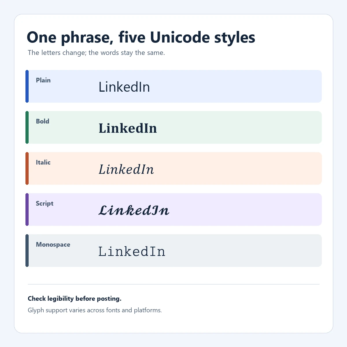
Enter a plain-text phrase, compare the previews, copy one result, and paste it into a LinkedIn post, headline, comment, or profile field. The output is Unicode text, not a font file or HTML formatting. Use a simple style, keep URLs and searchable terms plain, check mobile rendering, and retain the normal draft for editing and accessibility.
What a LinkedIn font generator actually changes
LinkedIn's regular composer has no general font picker for post text. A generator maps supported letters and numbers to similar-looking characters from Unicode blocks. For example, "Clear next step" can become "𝗖𝗹𝗲𝗮𝗿 𝗻𝗲𝘅𝘁 𝘀𝘁𝗲𝗽". The pasted value contains alternate characters, not a hidden bold tag.
This is not a real font face. Accents, punctuation, emoji, and other scripts may stay unchanged, while combining marks can affect selection or counts. Use the result as a short visual accent, not a replacement for clear writing or semantic formatting.
- The output contains Unicode characters that resemble a typeface.
- A plain-text copy should remain available for editing and accessibility.
Compare LinkedIn font styles before you copy
Use the table to compare emphasis, then test the exact words you plan to publish.
| Style family | Example | Good fit | Watch for |
|---|---|---|---|
| Bold sans | 𝗖𝗹𝗲𝗮𝗿 𝗵𝗼𝗼𝗸 | A short opening or section label | Can look heavy in a long paragraph |
| Serif bold | 𝐊𝐞𝐲 𝐩𝐨𝐢𝐧𝐭 | A compact result or takeaway | Some symbols have limited coverage |
| Italic | 𝘈 𝘲𝘶𝘪𝘦𝘵 𝘯𝘰𝘵𝘦 | A quote, aside, or softer emphasis | Can be difficult to scan at small sizes |
| Monospace | 𝚜𝚝𝚊𝚝𝚞𝚜: 𝚛𝚎𝚊𝚍𝚢 | Commands, labels, or exact tokens | Not every letter or symbol maps cleanly |
| Small caps | Sᴍᴀʟʟ ᴘᴏɪɴᴛ | A restrained label | Mixed glyph heights can reduce rhythm |
| Full-width | Focus | A very short decorative line | Consumes more horizontal space |
Bold sans, serif bold, and monospace are often easiest to read. Script, circled, and heavily marked variants work better as occasional accents. Reliable copying and clear limits matter more than a large style count.
How to use a LinkedIn font generator
Finish the plain-text message before adding style.
- Draft in normal textWrite and proofread the post, links, mentions, and line breaks in a regular editor.
- Choose a small targetSelect one hook, label, result, or short phrase so the visual hierarchy stays clear.
- Compare the live previewsTry several families and choose letters that remain recognizable in the LinkedIn field.
- Copy one resultUse the copy control or select the output manually. Keep the original phrase.
- Paste and review in contextCheck mobile wrapping, search terms, links, mentions, emoji, and length before publishing.
The generator does not log in or publish. Review the pasted result in LinkedIn; devices may render glyphs differently.
Useful examples: bold, italic, script, and monospace
A style should help readers scan: bold can mark a hook, italic a short quote, and monospace an exact command. Keep the surrounding copy ordinary.
A product post might style only "𝗟𝗲𝘀𝘀𝗼𝗻 𝟭". A technical update can show "𝚜𝚝𝚊𝚝𝚞𝚜: 𝚛𝚎𝚊𝚍𝚢" and explain it in normal text. Do not make a decorative style the only version of a name or instruction.
Plain source
Lesson 1: remove one unclear step.
Focused Unicode example
𝗟𝗲𝘀𝘀𝗼𝗻 𝟭: remove one unclear step.
Only the short label is styled. The searchable explanation stays in ordinary characters.
- Keep names, job titles, product terms, and numbers easy to recognize.
- Use one family consistently instead of mixing decorative styles.
Where styled text works on LinkedIn
Unicode output may work in posts, comments, headlines, About text, and some profile fields. Support depends on the field and chosen characters; a browser preview may wrap differently in the mobile app.
Style a short phrase instead of a whole post. Keep links, @mentions, #hashtags, dates, measurements, and technical names plain. Count the pasted result in the destination field when a limit matters.
Good candidates
- A short hook or label
- One result or metric
- A compact code or status
Keep plain
- URLs and email addresses
- Mentions and hashtags
- Names and search terms
- Long instructions
Search, accessibility, and readability trade-offs
A Unicode look-alike differs from the plain spelling. Search, browser find, translation, and recruiter tools may handle it inconsistently, so styled keywords can be harder to discover. Keep important professional terms in ordinary text too.
Assistive technology may announce mathematical characters clearly, skip them, or read them as symbols. Combining marks can add noise. Keep instructions, warnings, contact details, and job titles available in plain text.
- Use Unicode for emphasis, not to carry a message's full meaning.
- Keep a plain-text source for edits and reuse.
- Do not promise searchability, accessibility, or identical rendering on every device.
Check characters, limits, and mobile rendering
A generator's Unicode map is selective. Latin letters and digits often have bold, italic, script, double-struck, or monospace variants; accents, punctuation, emoji, and other scripts may stay plain. Leaving an unsupported character unchanged is safer than substituting a misleading look-alike.
Test the result at its intended width. Full-width, circled, superscript, and combining styles can lengthen lines or shift baselines. Review the opening, URLs, hashtags, and mobile layout.
| Check | Why it matters | Safer action |
|---|---|---|
| Character coverage | Unsupported symbols may remain plain | Keep the mixed output and review it |
| Length | Some glyphs or combining marks affect counts | Count after pasting into the destination |
| Line wrapping | Wide styles occupy more horizontal space | Preview a narrow mobile width |
| Copy behavior | Clipboard permission can fail | Use manual selection as a fallback |
A reliable generator explains these checks instead of claiming universal compatibility.
Keep a plain-text fallback before you publish
Save the ordinary draft before copying a styled version. It remains useful for edits, reuse, and accessibility checks, and lets you restore a character that looks wrong after paste.
Compare both versions before publishing. Check the meaning, links, and emphasis. If the style is louder than the idea, remove it; clear wording and spacing often help more than decorative characters.
- Store or copy the normal-text draft first.
- Apply styles after proofreading and review the pasted result on desktop and mobile.
- Remove any style that hurts clarity, searchability, or access.